Introduction To Cleantech Map Blog
The premise of this blog (or what, had it arrived online less than a decade ago would have been called a web log) is to explore concepts and deepen our understanding of the knowledge that surrounds design of clean technologies, here often called 'cleantech'. On one level, the metaphor 'picture the worlds' expresses the notion that design thinking can give us a steady hand on the rudder as we navigate through environmental upheaval—softened now to climate control—something we humans haven't seemed to be good at. But we're getting smarter. This is remarkable.
This is what Cleantech Map blog talks about: the map we are charting on the way to clean energy. Many acknowledge that we're adrift and now it's time, the first time really, people are agreeing that we have the ability but also that collectively we can build the will to invent the means to steer a new course. Whether or not we do this is the impetus of this blog.
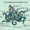
Frequently, postings will be accompanied by infographics or what we call 'cleantech maps'. These are not geographic maps like Google Earth; there are plenty of people already doing this. These cleantech maps are maps, or more accurately, graphics expressing ideas by which to steer the way to more environmentally nourishing design: Design of cleantech, design of policy and design of business.


